This post originally appeared here on the Productized Medium channel.
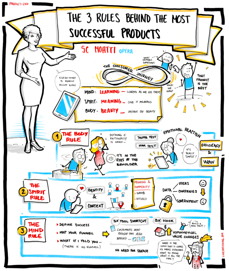
The more connected we become to our tech products, the more we expect the same from them. They are essentially an extension of ourselves. In her talk at Productized Lisbon 2017, Sophie-Charlotte Moatti lays out the three essential rules that every product needs to follow to be successful, drawing examples from her work experience at Facebook, Nokia, Uber and Pandora.
The Customer Journey

What is a great product? How do you create a product that people want to buy? And what are the rules behind making it? The more connected we become to our tech products, the more we expect the same from them. After interviewing and working with the most successful product people at Facebook Design, Uber, Nokia and AirbnbEng, SC Moatti discovered that the best products are just like our best selves — an extension of our own image. So, when we think of great products, we need to think first and foremost of what we are in our best selves.
The consumer journey is not just like a smooth, infinite, yellow brick road where customers are always happy and love your products. On the contrary, when your customer is looking for your product, his face usually looks like this:

The job of a PM is to go from a super anxious customer who looks to solve his problem, to a super happy customer who finds your product as a solution to your problem.
This customer journey can be codified as a product/market fit. Reaching that market fit makes every product manager happy, because it means that her product has actually found a group of people who find it useful, who appreciate it and who, finally, buy it. However, the minute we reach product-market fit, it changes: you get new customers and new different needs with them. Once you lose product-market fit, you have to fight for it again and reach out for a new audience. 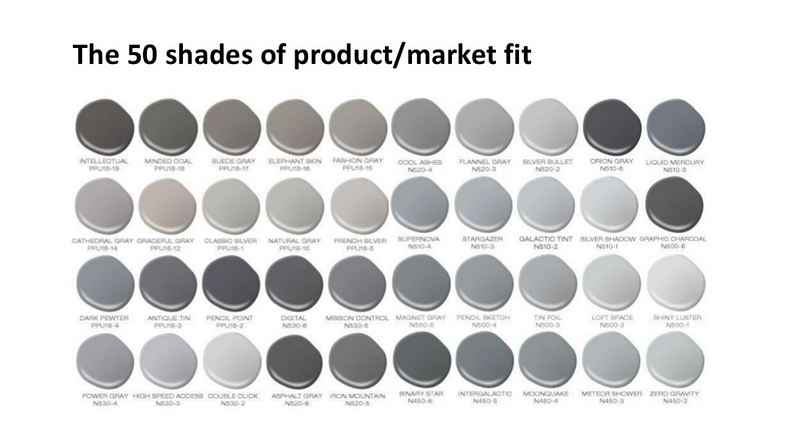
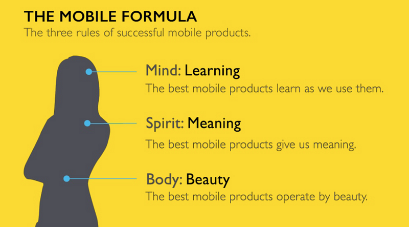
Drawing from her book Mobilized: An Insider’s Guide to the Business and Future of Connected Technology, SC suggests that in order to build the best product that matches customer needs, we need to build it out of our own best image. To describe this best image of ourselves, SC is using the Mind-Body-Spirit framework, as it applies to our bodies.
The Body Rule
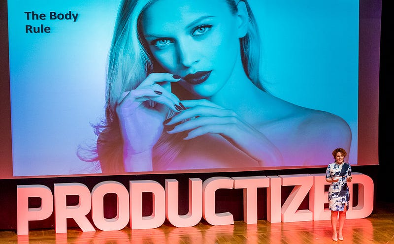
Starting with the body, we all want to look good and expect that our products are going to be exactly like that — beautiful.
To define beauty rationally is hard. For centuries, the greatest philosophers wondered why certain traits are considered beautiful and others aren’t. History has different views on beauty, but let’s try to divide it into two camps:
the scientific camp
the artistic camp
In the first scientific camp, you have ideas that admire beauty as a form of rational criteria that gives you a harmonic, mathematical music. Philosophers like Edmund Burke even found out formula for beauty: M (stands for beauty)= OOC (Order Over Chaos). For them, beauty is all about efficiency. And it is exactly the same thing for product: beauty is all about how you go from point A to point B very seamlessly, without wasting effort. Is is all about that specific user experience and that specific focus that you bring to your customer as they go through your product.
And there is another camp, a more artistic group, where they say:
Beauty is what is in the eye of the beholder.
It is not anymore about how you dress, how are your symmetrical features, but it is about how I, as a viewer, feel when I see this piece of art. We have exactly the same perception of technology: if you watch the videos of Steve Jobs launching the first iPhone, you would hear people clapping and even tearing up when Jobs pulls up the product.
That is exactly the same reaction we have with our mobile products. Often, when experience Facebook or Uber for the first time, it feels really magical, there is that strong emotional reaction. That is the definition of beauty when it comes to technology.
Beauty is a really strong efficiency when nothing is wasted + emotional reaction.
When you are building your products, you can apply beauty concept with these two tests:
Efficiency test. Or, in other words, the thumb test. Can you have your customer go through your use case just with a simple thumb? If yes, then you can tell that you’ve passed the test.
The “mom” test. Have a user of your product that can get really excited about your product, just like when you easily explain to your mom how technology works. The simple and “cool” reaction to your product means that your product is beautiful.
The above example is an outward experience of beauty. But how do you actually build that experience under the hood? In the nutshell, you have 2 sets of design elements to build beautiful products. Some help you focus, others help you expand.
Focusing design elements (efficiency):
If you follow the journey of the customer, there are 5 of essential steps you need to follow:
On-boarding. Your customer starts hearing about the product, he starts downloading it. You have to make sure that onboarding experience is very smooth and that you offer value before you ask for value.
Single-task. Once your customer is onboarded, you have to make sure that they go through the very simple and try out just one feature of your product. Once you customer completes this single task, then you can start showing them other things that your product does. Show them even better value they can get out of your product. As a Product Manager, keep reminding yourself: “I am here working with my customer to make sure they will actually buy this product.”
Navigation. Smooth navigation is the number one priotiry once your customer tries your product features.
Performance is a foundation of a beautiful product. Your speciality, for example, could be a specific to your product gesture.
Expanding design elements (wow): push and pull

All these elements are helping you to bring focus when you are building products. Some of them help you expand richness of your product, others are pushing and pulling your product towards your goal. Here is the golden question to ask yourself if you want to make your product shine: When do I need to get that specific information and when do I need to get permission for that?
SC suggests to ask this question as early as possible in your product journey, or do it as late as possible. As a case study, SC is giving an example of a messaging app Whatsapp.
The Spirit Rule
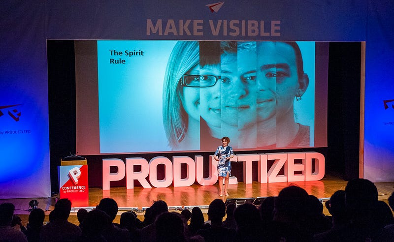
We all want to have meaningful lives. A lot of meaning in our life we get from our relationship. The same works with products. When we first start using the products, we are completely into them and we are always in contact with them. However, when we find ourselves in groups, we don’t really have the right/good rules to interact with technology. As product managers, you need to remember that depending how well we understand how people use our products, we are going to drive success of our product.
Level up your skills as Product Manager: Join Rene Bastijans & Andrej Balaz for a full day of lectures, live customer interviews and hands-on practice that will help you understand the progress customers are wanting to make by bringing products into their lives. Get 10% off the Masterclass on Jobs to be Done in Lisbon on 1st February 2018 (apply a JTBD2018 code at checkout).
The essence of mobile: identity + context
Do we expect that the products understand us? How do they know the things that we don’t know about ourselves?
In the context of mobile products, the technology knows 2 things they couldn’t have known before:
our real identity (state of health, sleep disorders etc,)
our context (geographical location, calendar,etc).
If you think how you can personalize your product on these two elements, you can read all the permissions that are available on your platforms (Android, Web, IOS etc) and ask yourself: “if I had those permissions, how would I use it in a unique way to build my product?” It is a very systematic way to build a highly personalized product. You goal is to be unique, personalized, differentiated.
Meaning and community: norms and rituals
We,as individuals, don’t like when others know personal information about us. The question is: how we, as product managers, handle with that resistance? There are actually few reasons you want to capture data and there are different groups of people who make use out of it:
1) the first group are the other people. As individuals, we don’t like identity theft and the role of a product manager is to to understand what we need to do to prevent information leak.
2) The second entity that can use our data are corporations. As a society, we actually like it when corporations are using our data, since we prefer corporations to use our data and take advantage of free service that is personalized.
3) The last entity that uses our data, is the government. If we see how governments operate today, there is probably a lot of potential for improvement in using technology products by the state and its services (let’s take as an example the way the government use personal data to manage the terrorists attacks)
The Mind Rule

The last rule of making great products it the Mind Rule. This rule is really about how we get good at things, just as how we get good at our hobbies and jobs. It is about practice that makes it perfect. All that methodologies that we use, Growth Hacking, A/B testing, Lean Product, all of them are basically saying one thing: there is a model to growth.
The mobile growth model:
Define your success metric
Map your funnel
What If I told you… Optimize that conversion funnel.
If you follow the mobile growth model, at some point you will get into diminishing returns. The way to get outside of those diminishing returns is to think outside the funnel. Think of your funnel as of horizon, then you can keep your product really exponential.Think of how you can really reduce the depth of your funnel (shortcut all the steps your users need to go through in order to make your funnel as thin as possible).
Here is an example: if you go on Amazon to order SC’s book, it will show you immediately 3 other books that you can buy on the same topic. If you are thinking horizontally, in infinite way, you will buy 4 books instead of one and then apply the knowledge you get from them into the process.
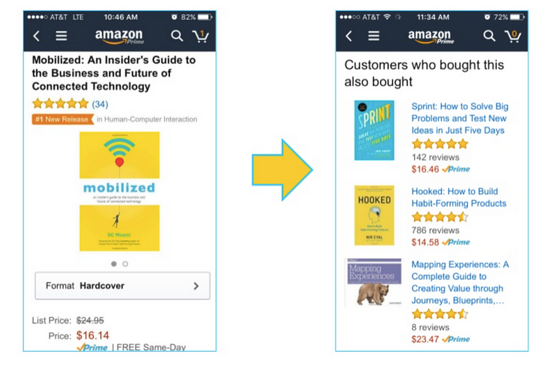
You still can use an Apple Pie Chart or A/B testing as iteration, but what really matters is that shortcut, which is the 3-x increment. This kind of approach will make your funnel flat. Remember, that what makes your product mobile beautiful is a “hook”, that light flavored value of your product that makes everybody want to come back to it all over again.
Becoming mobile — first is a cultural transformation.
